


Input item
The input item is a menu item that allows the user to input a string value. The input item can be used to collect user input and store it in a variable.
The input item has the following properties:
label: The label that is displayed on the screen.
default: The default value that is displayed in the input field.
callback: A callback function that is called when the input is submitted.
The input item can be created using the following syntax:
You can create an input item by specifying the label and the default value:
ITEM_INPUT("Name", [](char* value) {
    // Callback function to handle input submission
    // value is the string value entered by the user
    // Do something with the input value
})
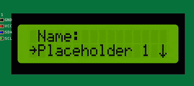
When the Name menu item is selected, an input field will be displayed on the screen, allowing the user to enter a string value.
You can create multiple input items in the same menu screen, each with its own label and default value.
This item can be further extended by creating a new class which inherits from ItemInput, for example you might need to:
Validate the input value before accepting it.
Limit the input length.
Display a message when the input is submitted.
etc.
class CustomInput : public ItemInput {
public:
    CustomInput(const char* label, const char* default_value, fptrStr callback)
        : ItemInput(label, default_value, callback) {}

    void on_submit(const char* value) override {
        // Custom logic to handle input submission
        // value is the string value entered by the user
        // Do something with the input value
    }
};
For more information about the input item, check the API reference.